Syke: school

designing the SYKE SCHOOL

Halfway through the development of Syke, my capstone project, one of the level designers had to take a leave of absence for health reasons.  At this point, we had essentially two options: To cut the level they were working on, or find the extra hands required to ship it.  After several discussions with teammates, producers, and the affected designer, I volunteered to fill the role.

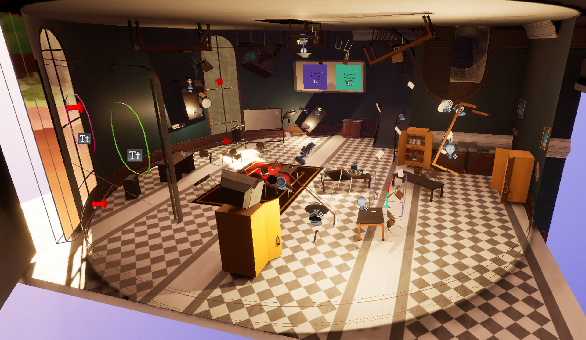
I knew that I'd have to approach this challenge with modular thinking and be open to ruthless iteration within the guidelines provided by the former designer.  Many of the mechanics and assets for the level were already in production, so this created interesting creative guidelines.  In the end, I'm proud to say that the school level is a personal highlight of the game.  It is a concise, polished experience, with an active narrative and interesting puzzles that take advantage of Syke's unique mechanics.

development stats

software

Unreal 5.3, ​Miro, HackNPlan

dev time

2 Months

team size

3-Person Subteam

position

Level Designer

the IDEADTION stage

The unique challenges and constraints of this design heavily influenced my output.  From the start, we had a good idea of what needed to stay the same, and what could be iterated upon.  Here's some context on what things looked like:

MUSIC

The music for this section, written by the ever talented Miles Clark, was already recorded and had a unique mirrored effect.  The level I was creating had to match the tone established by the music, and it needed an "inverted" element to show off the tunes.

THEMES

The school is the location where our two lead characters would meet.  To communicate this, I focused on themes of dawn, childhood,​ and repetition, as we communicate the sense of growing familiarity and friendship.  A school setting can easily imply anxiety, but this one needed to be comfy and bright.

VERSION control

Working on a small team with a very tight time limit, version control quickly became a primary concern.  With only three months to ship the level, I threw out our old pipelines and worked with the other developers to divide our concerns and focus on the MVP.  By splitting the level into discrete sections, we enabled more rapid iteration and implementation.

the CLASSROOMS

The puzzles and basic blockout for the level was already complete and under production, so I had an interesting creative restriction.  The three rooms ended up serving multiple purposes - as I mentioned under "version control," splitting the level up into four sections drastically sped up our art implementation process.  Rather than waiting for the level to be complete to begin art implementation, or stumbling over each other by working in the same rooms simultaneously, art could step in on a room-by-room basis as soon as design wrapped.  ​The above diagrams show some of my early concepts for the fundamental design of the space, which leaned heavily into Syke's gravity mechanics.  Ultimately, the school ended up being one of the more "normal" spaces in the game - the gravity inversion was a mechanical metaphor for confusion and anxiety, and the rhythm of primary school is a stable memory for our main character.  Within each classroom, things could get a little more playful, with navigational puzzles mirroring tests, confessions, and the quaint anxieties of a childhood romance.

starting line

When I stared working on this level, there were several whiteboxes that needed to be combined into a more cohesive vision.  The mechanics were being engineered and the art was being produced, so I was grateful to have these creative restrictions.  Building within the guidelines and carrying the level across the finish line was a more interesting challenge because of it.

the ITERATION stage

After the broad strokes and creative restrictions were established, it was time to start working on my contributions to the level.  The process of adding to and modifying the original design would require intense iteration, and every design decision was justified by player testing and narrative relevance.

pipelines

By establishing clear pipelines early, and with careful attention given to the order of operations for art, engineering, and design, I was able to maintain a healthy level of iteration throughout the development of this level.  Playtesting on a biweekly basis would not provide enough insight into the design, so I drafted producers, designers, and anybody I could convince to give my level a shot into testing.  In my early tests, I would collect at least a page of notes during each session, which I would immediately convert into actionable changes.  Once a room yielded less than a paragraph of notes, it was time to turn it over to art before any final tests.

cutting room FLOOR

My primary contribution to this level was streamlining the "hallway hub."  To the right is an experiment intended to create an "out of place" sensation, allowing players to stumble back into the hallway in a non-euclidean fashion which resists mental mapping.  Experienced designers may be unsurprised to learn that this worked too well, and testers were simply confused.

In an ideal world, I would have loved to refine the more bizarre elements of the level, but the game was due to ship in only a matter of months, and art implementation wasn't done.  In pursuit of the minimum viable product, I ended up cutting many of the hallway hub's more arcane elements, instead focusing on creating interesting puzzle rooms and allowing the player to have a "safe zone" to return to when things got a little overwhelming.

solution-based design

By quickly gathering qualitative data and uncovering problematic trends, I could focus designs on resolving these issues.  Using Miro boards like the one below helped visualize decision-making, revealing new issues before they arose and staying a step ahead on implementation - essential for the quick turnaround required.

the IMPLEMENTATION stage

Realizing this level in collaboration with the talented artists and designers on the team was an absolute blast.  In a true "all hands on deck" situation, I was contributing to the last bits of engineering polish and working with artists to finalize environmental details up to the last minute.

Working on the "chemistry room" was one of the most fun and collaborative experiences I had on this project.  During testing, our technical lead noticed some poor gravity behavior with the implementation we were using.  It wasn't a game-changing issue, but it was the kind of polish that my team was excited to do.  After some quick discussions and some light testing, the art team whipped up a stunning boutique asset which not only resolved the original gravity issue, but brought a refined and elegant air to the room that I couldn't have achieved alone.

tech work

There's more than a handful of tools and mechanics in Syke's release ​build with my code attached, but for this level, I took on implementing the "petri dish puzzle" seen below, as well as creating a "whitebox portal" for the design team to use while engineering put the last touches on our production portals.  See below for some before and afters!

The petri dish puzzle was more of a design challenge than a technical one.  This puzzle was consistently difficult because of a lack of signifiers, so I changed it from a color-based puzzle to a shape-based puzzle.  I programmed this mechanic through blueprints.

Portals were a notorious challenge for Syke, so I took some time to clean up their implementation.  It turned out that our portals were using resource-heavy sequences on every tick, so I reduced the complexity and optimized by turning off their visibility when the player can't see them.