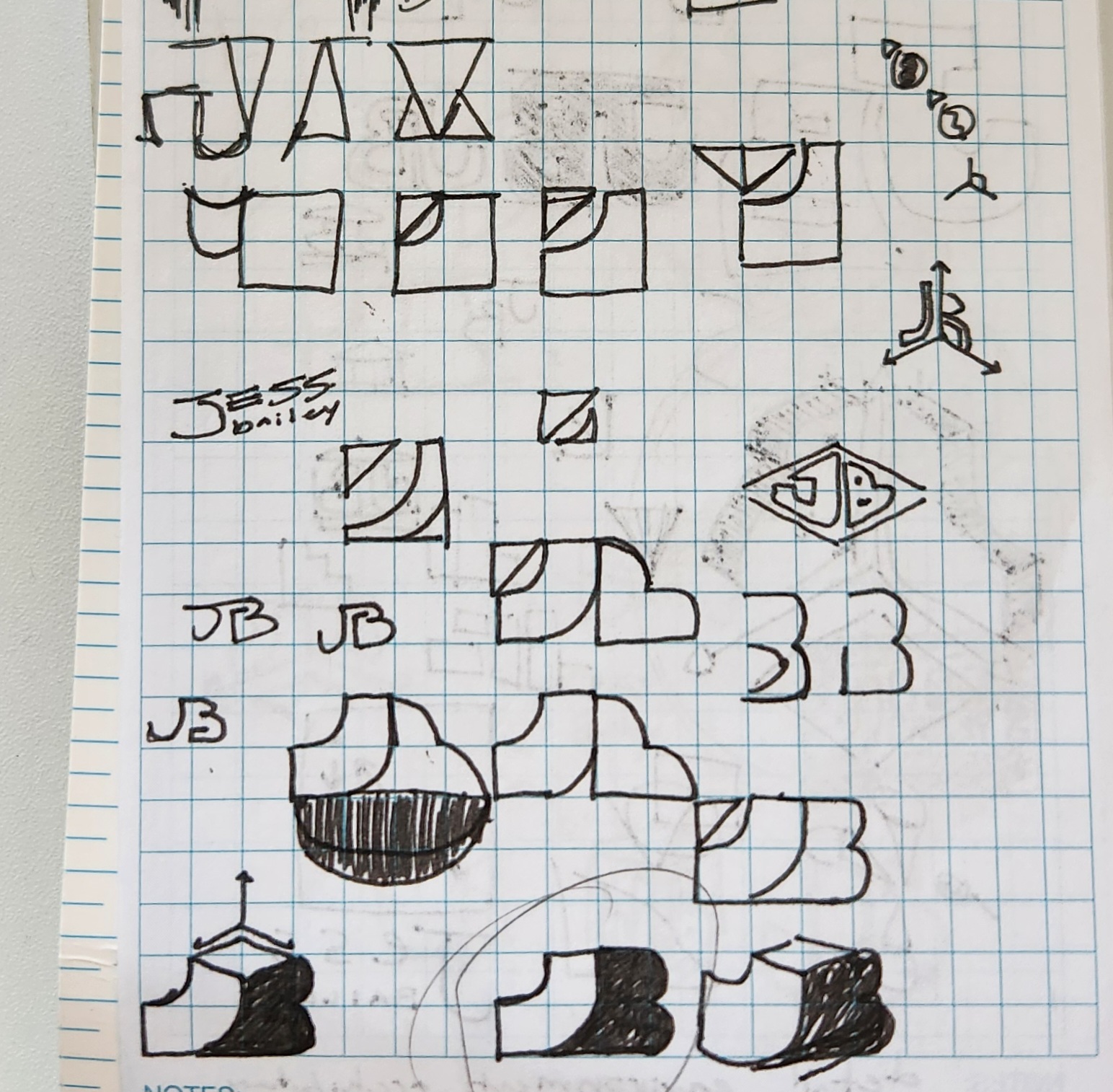
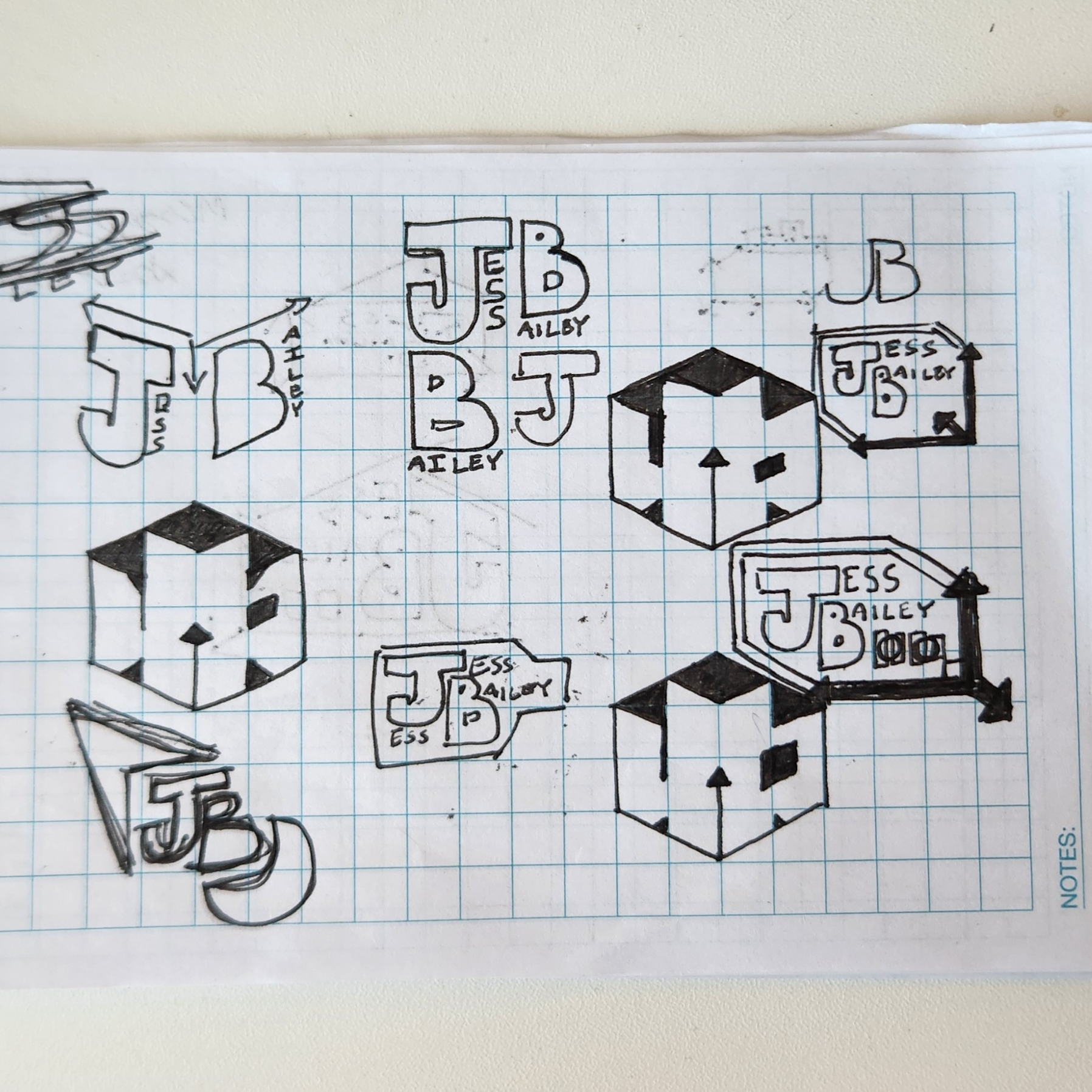
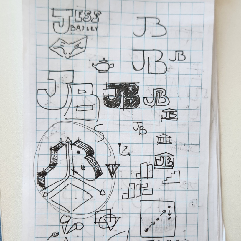
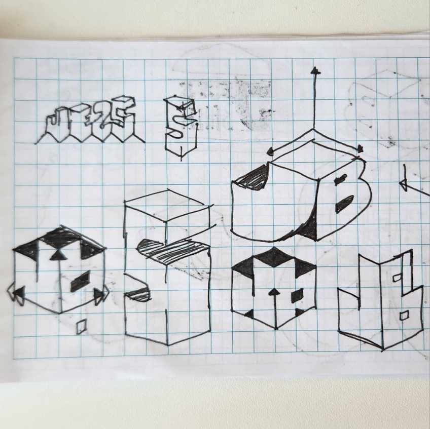
Jess is a 3D environmental artist with an emphasis on gothic architecture. This logo was a relatively quick exploration before I landed on a "gizmo" concept. As a bonus, the letters formed by the 3D shapes also export for a thoroughly gothic blackletter to be used as a single-color logo.
Haven is a level designer with a particular draw towards "invisible" design - in his mind, the hand of the designer should never be obvious. We worked together to land on something he was satisfied with, but everything went back to a "whitespace" parti.
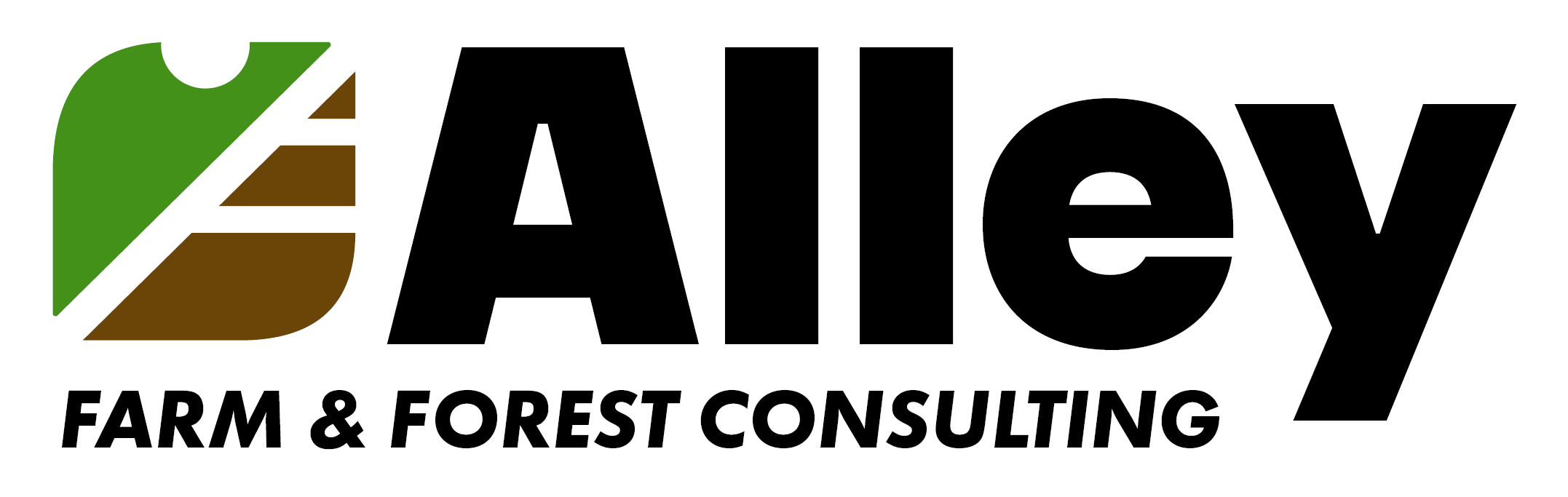
This logo's development was an exercise in simplicity. As I worked with the client, we experimented with many different levels of complexity as we dialed in a logo that could tell the "story" the brand required. The finished logo gives equal weight to the "farm" and "forestry," while retaining the personable circle shape via whitespace.
Like most great names, "Soup Ladle Studio" started as an inside joke that would take too long to explain here. However, as a double meaning, the studio was envisioned as a "ladle" by which talented and driven developers could be lifted out of the "soup" of prospective developers in the founders' community.
Creating an iconic lettermark has always been a bit of a nerd goal for me ever since I read The Lord of the Rings and was exposed to J.R.R. Tolkien's wicked cool lettermark. As a part of my recent brand overhaul, creating a new logo was important. Please hover over any iteration to read some of my thoughts on it! (This section is also available under "personal branding")
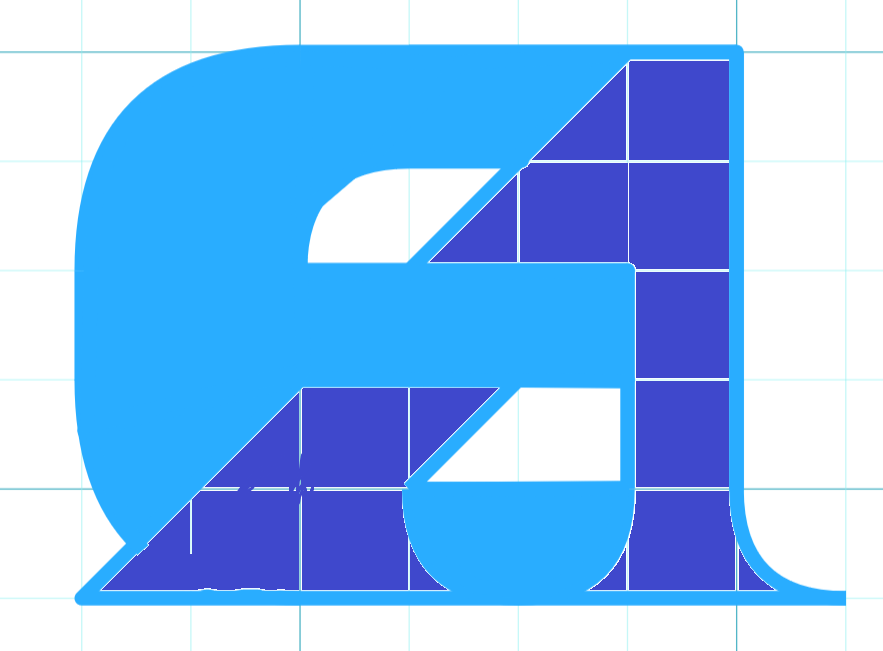
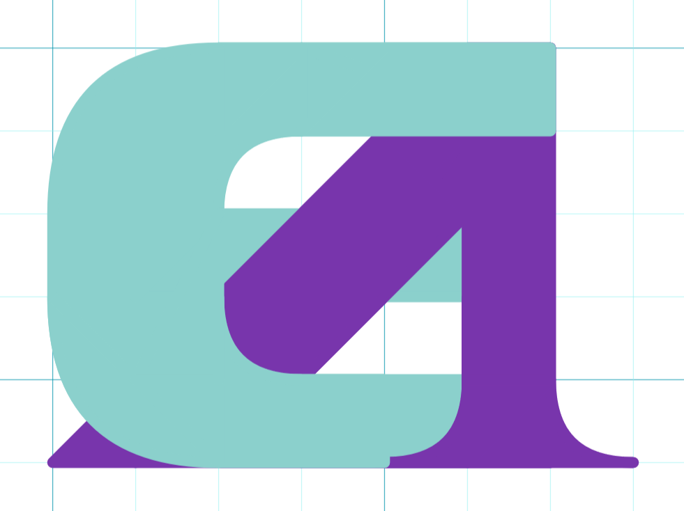
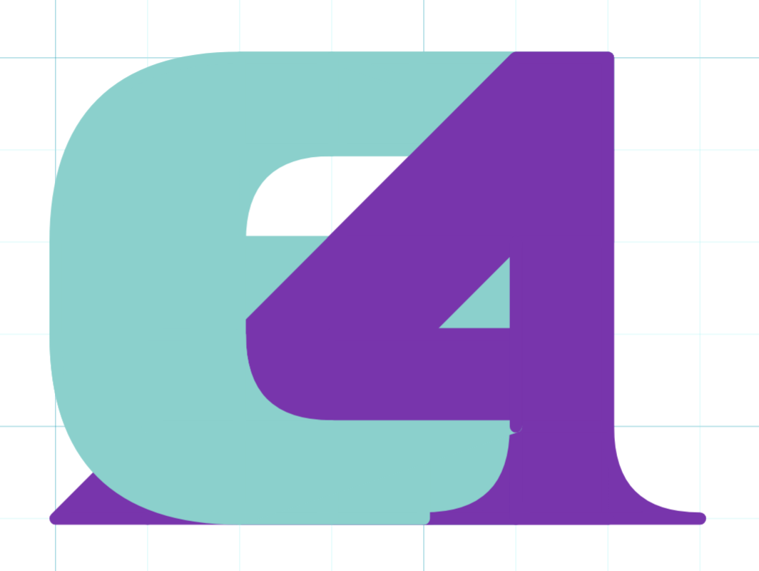
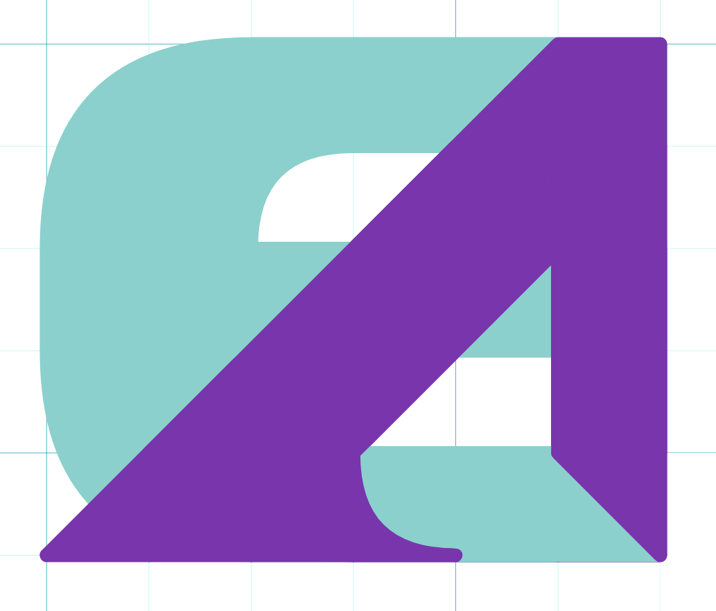
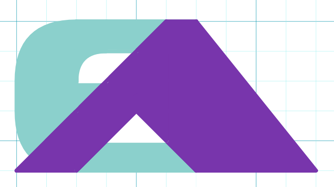
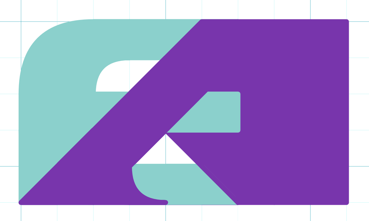
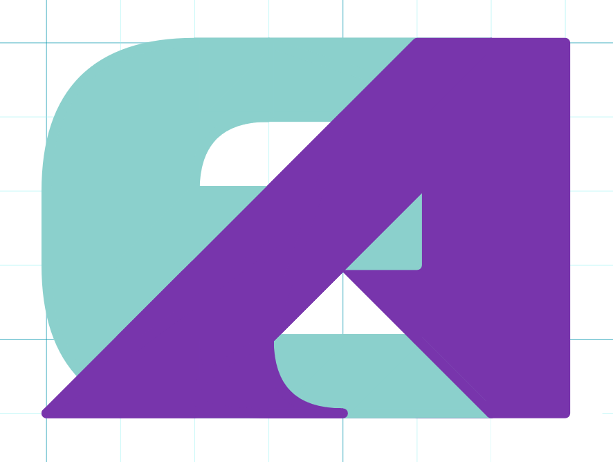
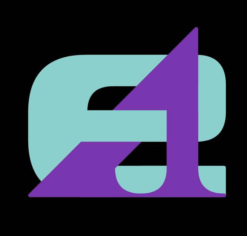
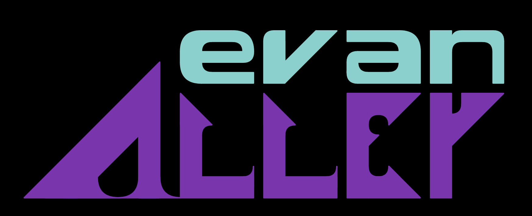
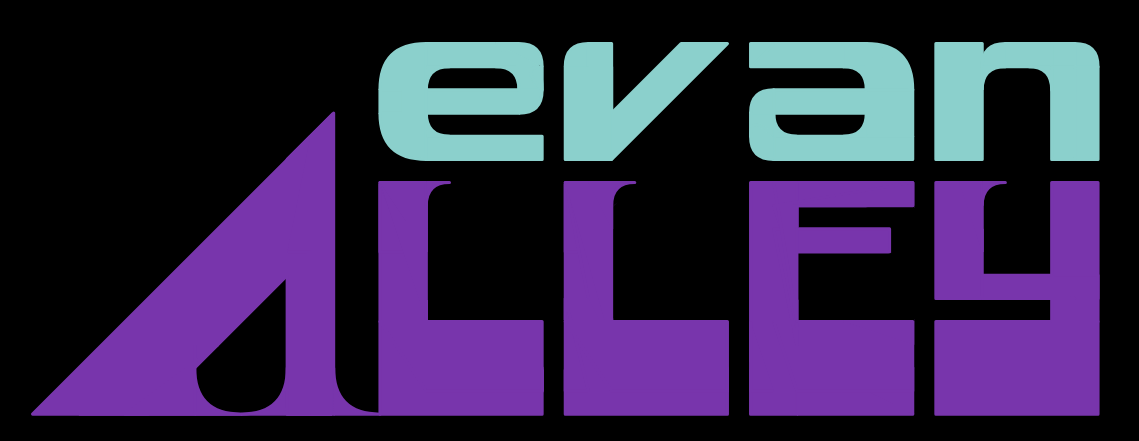
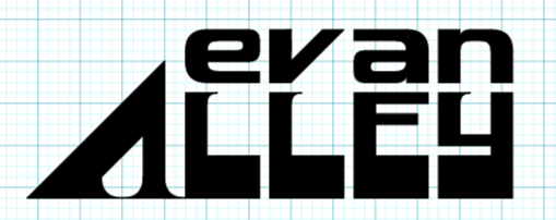
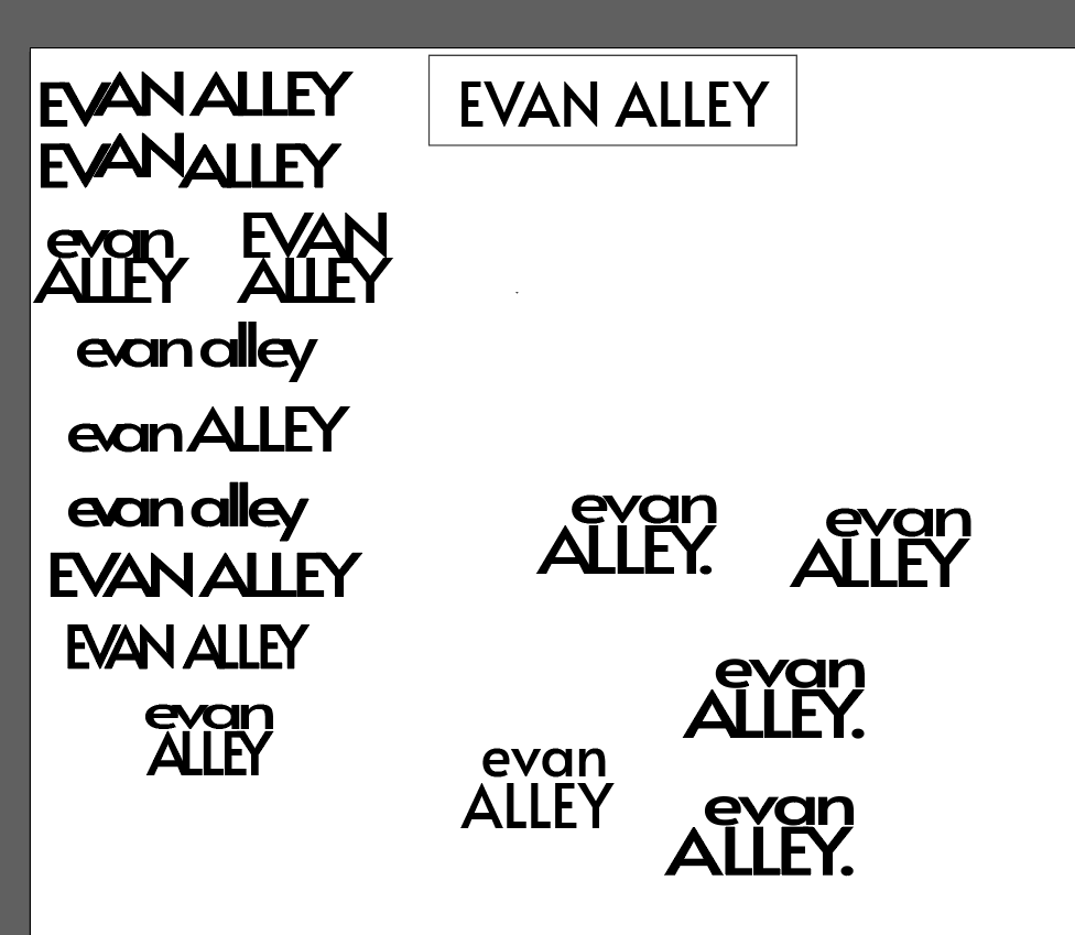
My first iteration of the wordmark was simply my name in all caps, in Alata. The iteration work on this logo can be seen below. Feedback indicated it felt like a clothing or designer brand, and this wasn't the image I was cultivating. Moving forwards, I kept the spirit of the first wordmark - a lowercase "evan" supported by a capital "ALLEY" - while integrating it into my wider brand identity. The "evan" font was simple enough to continue from lettermarks 'e' and just needed some minor refinements. "ALLEY" needed to convey support, momentum, technology, and taste. The 'A' is sized so that it creates a line encasing "evan," communicating the holistic sense of my designs. 'Y' was giving me trouble, and I was inspired by another font to try a thick baseline, at is the same weight as the stroke of 'A.' Subtle serifs on the inside edge of the letters gives the font a touch of class and momentum, and match the serifs on 'A.' Altogether, the design communicates an ideal of precision, with the grid-based shapes and the razor shape of a hobby knife.
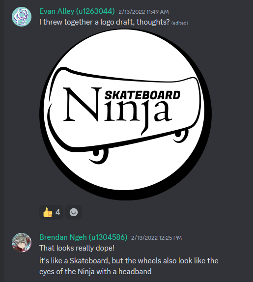
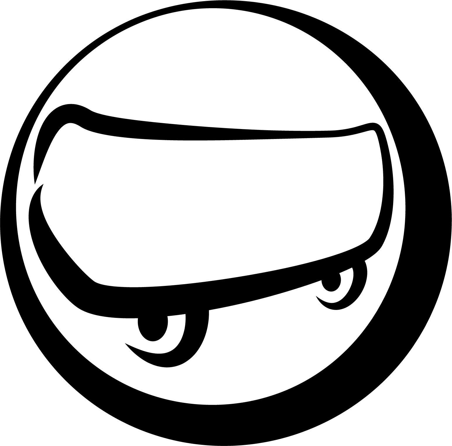
As the lead producer on Skateboard Ninja, it was my responsibility to "fill in the cracks" on the team, and one way I did this was by filling in as a graphic designer. This included the logo development as well as the final packaging designs.